Sort algorithm visualizer
An interactive in-browser visualization of merge sort vs. selection sort, used across AP CSA and Data Structures.
- Role
- Solo build
- Year
- March 2026
- Status
- Live
- Links
- Live artifact
- React
- Generators
- SVG
- Claude artifacts
The problem
I teach AP Computer Science A and Data Structures, and every year I run into the same wall. Students can write a sort. They can read the code, trace a run, and sometimes even predict the output. What they struggle to internalize is why one sort is fundamentally different from another: why merge sort handles a thousand elements without noticing while selection sort grinds. Big O notation, drawn on a whiteboard, doesn't bridge that gap. The abstraction lives in a different part of the brain than the lived experience of watching code execute.
I wanted students to see the difference. Not as a chart of theoretical operation counts, but as two algorithms running on the same input at the same time: one finishing while the other was still on its third pass. I wanted the visualization to be slow enough to trace move-by-move when a student got curious, and fast enough to feel the asymptotic gap when they didn't. The point wasn't to teach Big O over again. The point was to give students an experience that made Big O obvious.
What I built
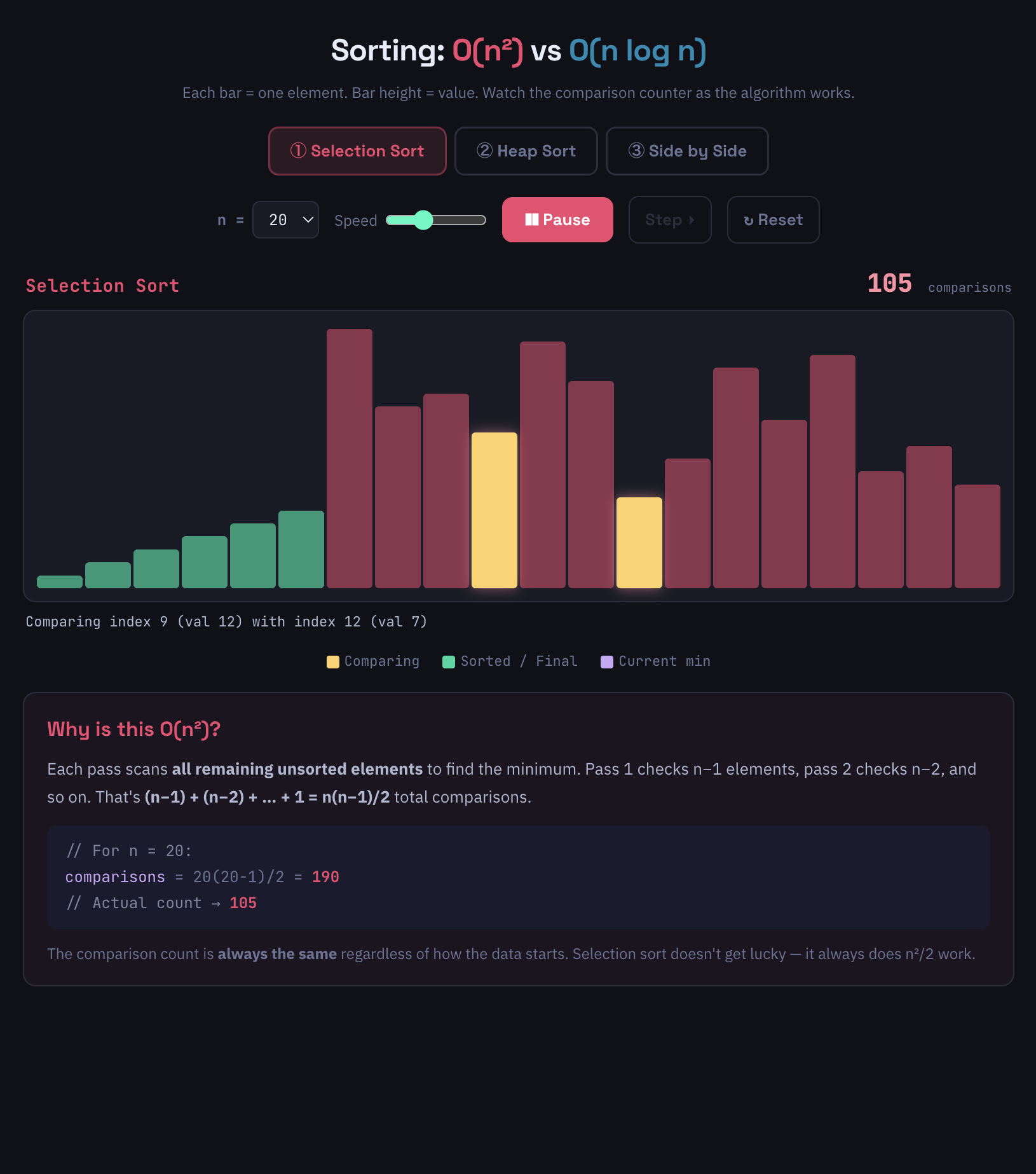
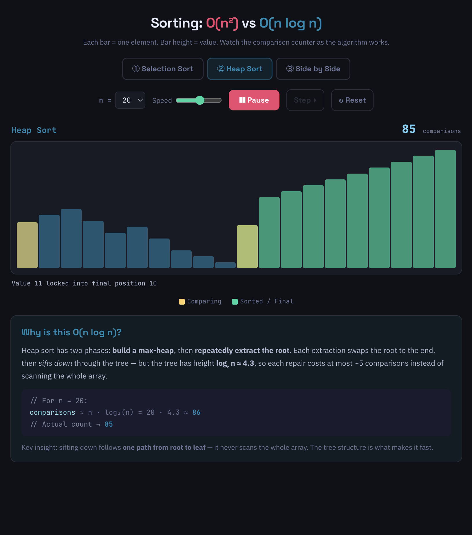
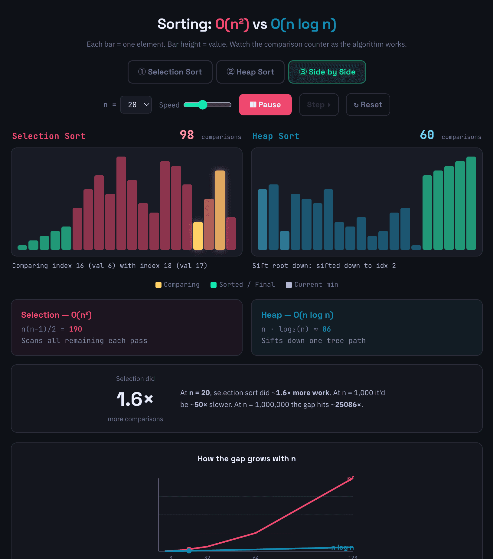
A side-by-side visualizer that runs merge sort and selection sort on the same input array, with a control panel that lets a student step through one move at a time, slow the animation down to a few frames per second, or speed it up until the sorts race to completion. The bars representing array elements move and re-color as comparisons and swaps happen, so a student watching the merge sort sees coherent halves being combined while the same student watching the selection sort sees a slow linear sweep finding the next minimum, over and over.
Built and published as a Claude artifact, meaning the entire thing lives inside a published Claude conversation, runs in the browser, and needs no deploy step or hosting setup to share with a class.
Key decisions
Side-by-side, not stacked. Two sorts running in adjacent columns is the whole pedagogical point. Stacking them vertically would have let students watch one then the other; running them simultaneously forces the comparison. The moment a student sees the selection sort still on pass two while the merge sort is already finishing, the Big O lesson has landed without me saying anything.
Generator functions for sort state. The visualizer needed to be pausable, steppable, and resumable: a student should be able to advance one comparison at a time, scrub the speed slider mid-run, or restart with a new input. JavaScript generator functions (function* with yield) are exactly the right tool for that: each yield represents one step of the algorithm, and the calling code controls when to advance. I'd seen generators used for animation and iteration in other contexts and reached for them here. The alternative (managing sort state in React state and threading "where am I in the algorithm" through props and effects) would have been a tangle.
Hand-rolled SVG, no charting library. The visualization is a row of rectangles whose heights and colors update as the sort progresses. A charting library would have meant fighting its animation model and styling assumptions. Plain SVG nodes inside a React component meant the visual was exactly what the algorithm was doing, with nothing between the two.
Built as a Claude artifact. The whole thing was developed inside a Claude conversation and published from there. No build pipeline, no hosting decision, no domain: students get a link, the link opens the artifact in their browser, and it runs. For a classroom tool that doesn't need to scale beyond "the students I'm teaching this semester," removing every step between "this works" and "students can use it" was the right tradeoff.
How it works
The core of the visualizer is two generator functions, one per algorithm. The selection sort generator yields after every comparison and every swap, marking the indices it just touched so the React layer can color them. The merge sort generator does the same, yielding at each comparison during a merge and again when a value gets placed into the merged sub-array. Both generators are pure: they don't render anything, they just produce a sequence of states.
The React layer wraps each generator in a small driver. The driver pulls the next state from the generator on a setInterval tied to the speed slider, holds the current state in component state, and re-renders the SVG. When the user clicks "step," the driver pulls one state and stops. When the user slides "speed" to maximum, the driver pulls states as fast as the browser can render. When the user resets, the driver throws the generator away and instantiates a new one with a fresh input array. The same pattern works for both algorithms because they expose the same generator interface: yield a state, wait, yield the next state.
The result is that "step through manually" and "watch it race" are the same code path with a different interval. That's the pedagogical payoff of the generator pattern: pause and play aren't separate features, they're the same feature at different speeds.
What I'd change
The visualizer compares two sorts on the same input. It doesn't yet let a student pick the input: sorted, reverse-sorted, near-sorted, all-equal. Those edge cases are where the constants in Big O start to matter, and where merge sort and selection sort behave in ways students don't expect (selection sort runs the same number of comparisons regardless of input order; merge sort's behavior varies with the data). A "choose your input" mode would turn the visualizer from a complexity demo into a complexity-and-edge-cases lab. That's the next version.
Stack and links
Built in React with hand-rolled SVG and generator functions for steppable sort state. Developed and published as a Claude artifact in March 2026, then used in AP CSA and Data Structures across two cohorts.